


Banner Letter Sizes - What You Need To Know
| Letter Height | Best Legibility | Maximum Distance |
|---|---|---|
| 3” | 30’ | 100’ |
| 4” | 40’ | 150’ |
| 6” | 60’ | 200’ |
| 8” | 80’ | 350’ |
| 9” | 90’ | 400’ |
| 10” | 100’ | 450’ |
| 12” | 120' | 525’ |
| 15” | 150' | 630’ |
| 18” | 180' | 750’ |
| 24” | 240' | 1,000’ |
| 30” | 300' | 1,250’ |
| 36” | 360' | 1,500’ |
| 48” | 480' | 2,000’ |
| 60” | 600' | 2,500' |
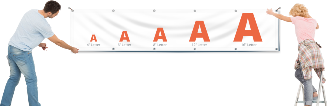
As you can see, a good rule of thumb is every 1 inch of letter height provides 10 feet of readability with the best impact. For example, 3” tall letters make the best impact within 30 feet; however, they can still be seen and read from up to 100’ away.
Pay close attention to the size of your banner design, which you want to be easily recognized, read and understood from a distance. One-inch-tall letters might seem large to you up-close, but, they’ll be hard to read further away. If you want customers to be able to read your banner from 100 feet away, you should be able to read your letters from that same distance.
On the other hand, if your customers will be up-close, you don’t want to make your letters so large that they can’t be read from 5 feet away. In short, designing the perfect sign is all about finding the right combination of high visibility and average viewing distance.
An understanding of how large the letters should be on any signage involves creating optimum viewer legibility. The copy area of a sign is that portion of the sign face encompassing the lettering and the space between the letters, as well as any symbols, illustrations, or other graphic elements. It is a critical component of effective letter size selection because it establishes the relationship between the message and the negative space necessary to provide the sign with reasonable legibility over distance.
-
Thickness of letters
Thinner letters will be harder to read. Choose a simple bold font that will help grab attention. Test out letter sizes in your office by printing out a word or two and taping it up on the wall.
-
White Space
White space is the open area around the copy. We recommend using the 40/60 rule. Generally, copy should take up 40% of the sign, and 60% should be white space. This will allow your words to “breathe” and be more readable. White space will help correctly sized letters contrast with the background and stand out to the reader.
-
Kerning
Kerning is the space between the letters. This will go hand in hand with white space. Spacing your letters too closely will make the copy very hard to read. Don’t make the mistake of having extremely large letters, extremely close together; this will heavily reduce the readability of the copy.

If you plan on placing your signage along a road, you need to do some research regarding the speed limit, number of lanes, how busy the road is and if the sign will be near a stoplight or stop sign. The size of your letters need to be large enough to read in the few seconds you have the viewer’s attention.
A quick reference guide is shown to the left
If an exact determination of letter height is required for a specific sign, an easy to use formula can provide you with the information you need. The following equation can be used to determine accurate letter heights for signs by taking into account the number of lanes of travel and the distance of the sign from the curb.


