Effective Large Banner Design
When it comes to designing and printing a banner for your business (or on behalf of a client), there's a lot of things that you need to consider. Even if you're relatively experienced in other forms of print design (e.g. sticker or leaflet design etc), there are a few aspects of a great banner design that many designers tend to neglect and often, these are crucial to the success of your banner.
Unlike many other printed marketing materials, banners need to be quickly readable and viewable from a distance and therefore, there are certain elements of the design that will need to be emphasized to ensure that this is the case.
Banner Placement
The first thing you should think about before making any other design-related decision is the intended placement of your banner. Although it might seem like we're working backwards to some extent, the intended placement of your banner is likely to affect the choice of color scheme (or even the entire design) used for your banner. Ideally, the color scheme of your banner should be highly contrasting in comparison to its placement.
Use Large Text
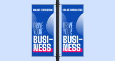
One thing that you need to remember about banners (that differs from many other marketing materials such as leaflets and flyers) is that in most cases, the aim is to attract attention from a distance. Because of this, you need to make sure that any content written on your banner is written in large readable text as without doing this, it's unlikely that your banner will be readable to anyone more than a few meters away. Read more about banner text size here:
Choose A Bold and Readable Font
It isn't just the size of your text that matters though; you also need to think about the font that you're using along with the weight of that font. There are a lot of different fonts out there and it can be tempting to choose an overly flamboyant one but when it comes to banners, you always need to factor in readability. Typically, bold sans-serif fonts will be more readable than serif fonts but this rule isn't set in stone. For example, some serif fonts such as Times New Roman can be highly readable even as newspapers.
Provide A Simple Message
Another extremely important point to remember when designing your banner is to keep the copy/message as simple as possible. Many successful banners are very simplistic in terms of the actual text content as most feature nothing more than a few words. The reason for this is simple; banners need to communicate your message in as little time as possible as most of the target audience simply don't have time to be reading paragraphs of text (most are walking or driving by). When designing your banner, make sure to really think about the copy that is and isn't needed. Try to remove anything that is unnecessary and communicate your message in the most simple way you can.
Include Necessary Information
Reinforcing the previous point about removing anything unnecessary, it's also important that you apply the same idea to the information contained within your banner design. In order to know what to include, you need to think about exactly what you want to achieve with your banner. Are you simply looking to increase brand awareness? Or are you looking to inform viewers about a certain product/service or aspect of your business? Is there a specific action you want them to take? If you're just looking to increase brand awareness with your banner, you might need nothing more than your company name and/or logo. When you're designing your banner, you really need to keep in mind the aim and include only information that is likely to help bring results. For example, don't include your business address if it isn't needed at all; it will just clutter the design.
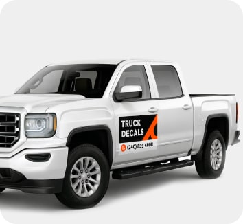
Use High Quality Graphics and Photos
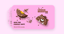
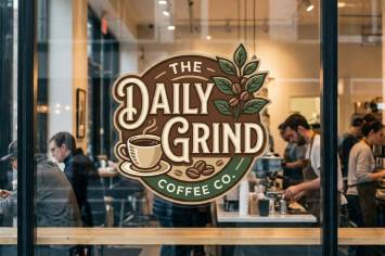
As the aim with most large vinyl banners is to attract attention (often from a distance), you need to do everything you can to draw the focus of passers-by to your banner. We've already mentioned color, typography and sizing - but another important aspect is to include high-quality graphic images. Images can act as a focus point for your banner and therefore, will often entice passers-by to cast a glance in your direction. Not only do high-quality graphics help to draw attention, but they can also help to reinforce your message and/or communicate an emotion without the need for any more text.
Keep Your Brand In Mind
Lastly, it's important to remember that although all of the points mentioned in this guide will ultimately help your banner to stand out and attract attention, you should also keep your brand in mind throughout the entire design process. Just because a certain color might be the brightest, it doesn't necessarily mean it should be used in your banner design if it doesn't fit in with your existing brand.
Choose appropriate colors
All colors have different associations, and it’s important to consider what types of emotions you want to evoke in your viewers. Your color choices have to be on point, because the colors are the first thing that viewers notice in a large banner.
Colors can also be subjective, and have different associations in different cultures, so make sure to study you target audience when selecting your colors. Below is a list or colors and the kinds of emotions they typically evoke in viewers.
Red
Associated with danger, passion, anger, excitement, speed, and love. The most powerful color and attractive to all audiences, also known to stimulate appetite. Use in moderation.
Orange
Associated with vitality, happiness. Not as overpowering as red and it energetic, inviting and friendly (it’s a great color for a call to action button.)
Yellow
Associated with humor, sunshine, optimism, energy. Touches of yellow can capture a viewer’s attention and it’s even more energetic than orange and red and should be used judiciously – too much yellow is irritating to a viewer’s eyes because it reflects the most light of any color.
Green
Associated with health, freshness, wealth, the environment, growth, nurturing, and new beginnings. It’s the easiest color on the eyes.
Blue
Associated with safety, trust, clarity, serenity, intellect, formality, elegance, truth, refreshment, coldness, masculinity.
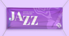
Purple
Associated with luxury, royalty, extravagance, wisdom, magic, ambition, femininity, and creativity. It has a soothing, calming effect on a viewer.
Pink
Associated with love, sweetness, femininity, and babies. The most feminine color.
Black
Associated with exclusivity, evil, mystery, power, prestige, grief, and formality. It’s traditional, and corporate and black text on a white background is the most readable color combination.
White
Associated with purity, cleanliness, modernity, sterility, simplicity, honesty, innocence, virginity, goodness.
Brown
Associated with nature, wood, leather, and humility. Balances out stronger colors, and good for background colors and textures.
Gray
Associated with neutrality and practicality. When used as a background it intensifies other colors.