


5 Important Design Tips For Large Banners
Signs, banners or posters: whichever name you want to use for the large print you’re making, it’s important to ensure that it stands out from the crowd—and only in a positive way. To create a print that makes people take notice, you’ll need to choose the right images, colors and fonts—and you’ll need to fit everything into a balanced design. It’s also helpful to understand the difference between vector images and bitmaps, CMYK versus RGB colors, and more.
Because our modern world has become so reliant on digital processes, it can be easy to overlook some important differences when preparing a banner for printing at Printastic.
These design tips will help you avoid the most common challenges to large format printing.
1. Vector Images Vs. Bitmaps
Because banners are large, try to use vector images wherever possible. Vectors work a little differently from JPEG and other bitmap formats. Unlike bitmapped images, vectors aren’t comprised of individual pixels assigned with a fixed location and color value; instead, their shapes, lines, and colors are defined by mathematical equations. This means that no matter how large you scale a vector image, it will stay sharp. Bitmaps, on the other hand, have a set number of pixels to work with and will have a jagged, blurry look if you scale them up too far.

Another advantage to vector images is that their file sizes tend to be smaller than equivalent bitmaps. This might not seem important at first, but over time it helps to keep your computer operating quickly, reduce your upload and download times and prevent your storage drives from filling up too rapidly.
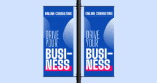
2. Choose Your Fonts Wisely
Banners are meant to be viewed from a distance, which means you’ll need to choose fonts not only for style, but also for readability. Many people find script styles and serif fonts more difficult to read, but some sans serif fonts pose readability challenges, too.
For example:
- Sans serif fonts with wide letter spacing make the gaps between words less obvious.
- Fonts that crowd letters together make it hard for people to distinguish between each letter.
- Fonts that are too bold tend to look crowded.
- Fonts made with very thin lines tend to get lost in the background.
- To test a font for readability, back away from your monitor and read it from a distance.

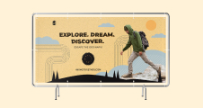
3. Color Choices
As with fonts, viewing distance is a key consideration when choosing your colors. Pick a background color that contrasts nicely with the text and graphic elements to ensure that viewers can read your banner easily. Another trick is to keep the color scheme simple; in most cases, two or three colors will suffice. However, if you’re making something that people will stop to read—like a movie or event poster—you can definitely use a broader palette.
Another mistake that people make regarding color is that they mistakenly think they need to set their design software to CMYK mode rather than the RGB color space. If you design in RGB, you have a larger color gamut to work with, as well as the following additional benefits:
Benefits of Designing in RGB:
- RGB File Sizes are about 25% smaller than CMYK
- Many filters and functions are only available to use in an RGB colour mode in PhotoShop® and similar programs.
- The RGB colour gamut is larger than CMYK
- Working in RGB means that your images are web-ready with no colour conversion (as opposed to designing for print in CMYK and converting the colour to RGB for web-use).

4. Balance Is Key
Banners, signs, and posters all have one thing in common: they’re meant to be read and absorbed quickly as people move past them. This means that you shouldn’t clutter your print with tons of graphics and text. However, if you want to grab people’s attention, your design shouldn’t be too sparse, either.

Here are a few ways to balance your design:
- Use only a few well-placed graphics. Maintain plenty of space around each graphic so that you don’t overload your viewers with information.
- Feel free to use simpler graphics like line drawings and stylized logos or artwork. Compared to intricate designs, these kinds of images are easier to understand at a glance.
- Go easy on the text. For banners and signs, a headline and a subheading or a few short, simple sentences should be enough to get your point across quickly. Event posters are a common exception, requiring extra details like dates, times, and locations.
5. Factoring for Page Bleed
Page bleed is another element of large format printing that is easy to overlook, but fortunately it’s also easy to fix. Bleed is a printing term that means a document’s image or color goes right to the edges of the paper. When you leave space for the bleed, you’re giving the printer a margin of error to work with. Otherwise you’ll need to print it on larger paper and then trim it.
Ensure that nothing is lost to the bleed by factoring between 3 and 5 millimeters of space on each edge. Fill this area with your background color, but make sure that text and graphics don’t drift into this area - or you may lose them during the printing process.


